MTTx Analytics
MTTx is shorthand for Mean Time To____ , a set of metrics used to help determine the overall health of incident management processes. This Analytics page groups and visualizes these metrics so you can understand overall health by entities like teams, impacted services, and more.
Groupings and Filters
FireHydrant's analytics offer the ability to filter and group by various aspects:
- Grouped by - Selecting different groupings will change the results shown in subsequent graphs and tables
- Service
- Environment
- Functionality
- Team
- Severity
- User
- [Custom Field]
- Date Range - You can tailor your results to specific time ranges. The range selector allows a visual selection of date range as well as selecting pre-configured ranges and typing them in
- Incident Name - You can also search and filter analytics according to incident names
- [Other Filters] - Any filters available on your Incidents page are also available here for paring down datasets
Grouping by User
When you select User from the Grouped by dropdown, the MTTx analytics view shifts to show responder impact — metrics focused on which users were most active and engaged in incidents during your selected timeframe.
What "Time in Incident" Means
The primary metric shown when grouping by User is time in incident, which measures how long each user was actively engaged in incidents. This is calculated as the span from a user's first interaction to their last interaction within an incident.
How it's calculated:
- First interaction: Timestamp when the user first takes an action in an incident
- Last interaction: Timestamp when the user last takes an action in an incident
- Time in incident: The duration between these two timestamps (ISO 8601 format)
- Minimum credit: Even a single action (like sending one message) credits the user with at least 15 seconds of involvement
Example: If a user sends a message at 2:00 PM and their last action is at 2:45 PM, they're credited with 45 minutes of time in incident.
What Counts as an Interaction
An interaction is any action a user takes in an incident. This includes:
- Chat messages — Messages sent in the incident's Slack or Microsoft Teams channel
- UI notes — Notes posted directly in FireHydrant
- Role assignments — Being assigned to an incident role (e.g., Incident Commander)
- Task updates — Creating, updating, or completing incident tasks
- Status/milestone changes — Updating incident status or milestone
- Team assignments — Assigning or unassigning teams to the incident
- Follow-up updates — Creating or updating follow-up items
Bot actions and integration-only events (e.g., automated alerts from third-party tools) are not included.
The User Analytics View
When grouped by User, the analytics show:
- Top 20 responders by total time engaged across all incidents in your selected date range
- Incident count over time — How many incidents each responder participated in during each week or month
- Sorted by time in incident — Users are ranked by total engagement time (helpful for identifying who was most heavily involved in incident response)
This view is useful for understanding:
- On-call burden — Which team members are spending the most time on incidents
- License utilization — Who among your licensed responders is actively engaged in incident management
- Responder distribution — Whether incident response is evenly spread across your team or concentrated on a few people
- Burnout risk — Identifying individuals who may be shouldering disproportionate response load
CSV Export for User-Grouped Analytics
When you download the analytics table as CSV while grouping by User, the file contains:
- Column 1: User name
- Columns 2+: Incident count for each time period (weekly or monthly, depending on your resolution selection)
For a detailed explanation of the "time in incident" metric and what you're measuring, refer to the section above. You can use this data to cross-reference with your incident list or on-call schedules to understand engagement patterns.
Baseline Metrics
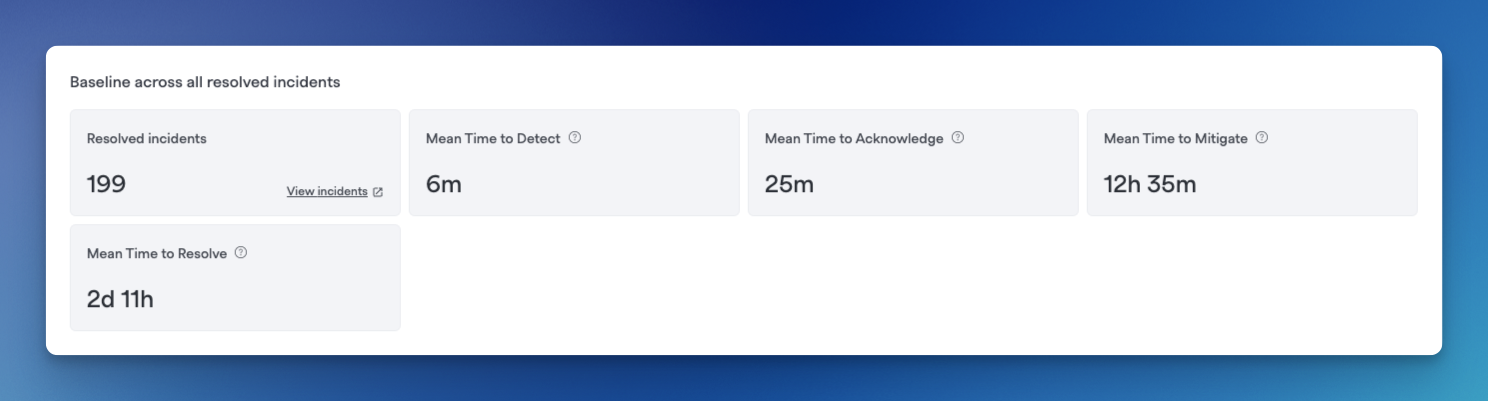
Example baseline metrics
FireHydrant offers the following MTTx metrics out-of-box:
- MTTA - Mean Time To Acknowledgement
- MTTD - Mean Time To Detection
- MTTM - Mean Time To Mitigation
- MTTR - Mean Time To Resolution
However, you can customize your MTTx metrics by defining custom measures. For more information, visit Custom Milestones.
This panel also shows the number of resolved incidents for the selected timeframe and filters. You can click on View Incidents in the leftmost box to view the full list of incidents for the selected filter on the Incidents page.
Top Impacted
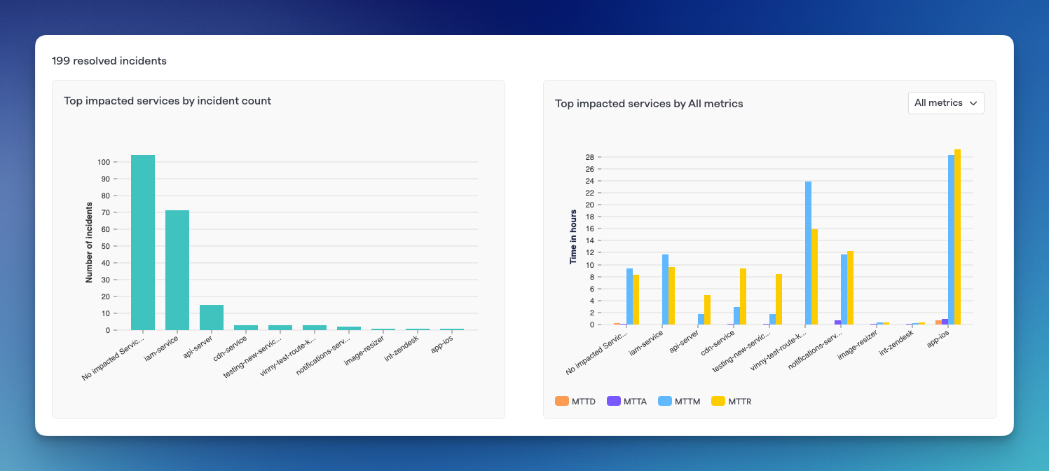
Top impacted by grouping
Depending on what Grouping you've selected above, these graphs will show a breakdown of incident count by value along with MTTx values. The chart on the left shows Top impacted[component] by incident count while the right side shows the same components' MTTx values.
Each bar or bar cluster can be clicked on to filter to that specific data set on the Incidents page.
Milestone Metrics
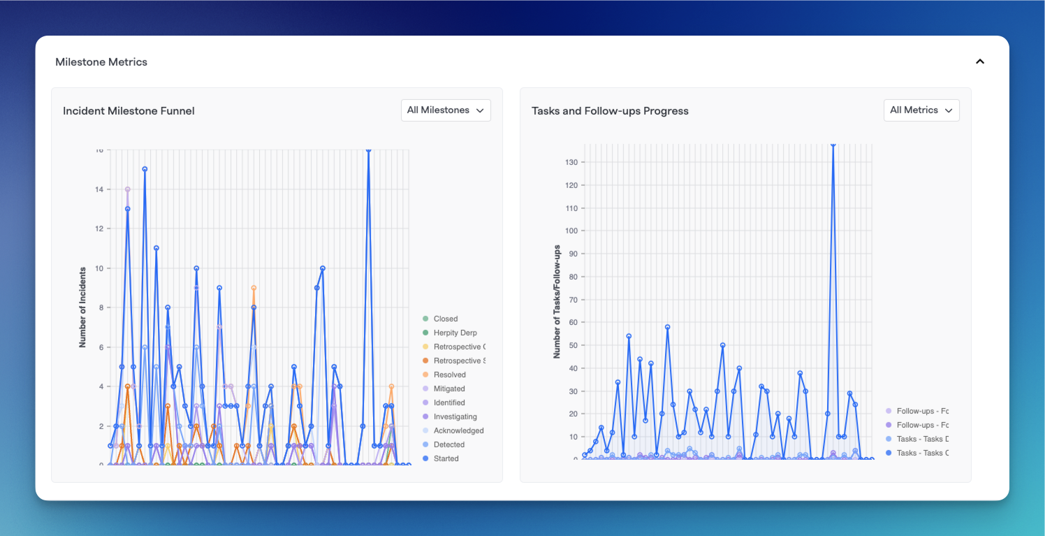
Milestone metrics graphs
These graphs will show milestone metrics for all of the incidents that match selecting filtering and groupings above.
The left chart shows a Time period vs. Number of incidents chart with different lines showing each milestone and the number of incidents that reached that milestone within each time period.
The right chart is a graph of Tasks and Followups created within each time periods according to the selected groupings and filters.
You can hover over each axis point of data to see in-depth information.
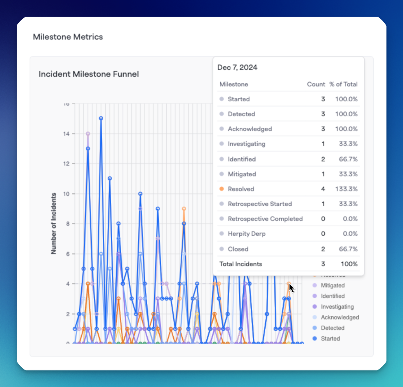
Hovering over a specific data point
Groupings Table
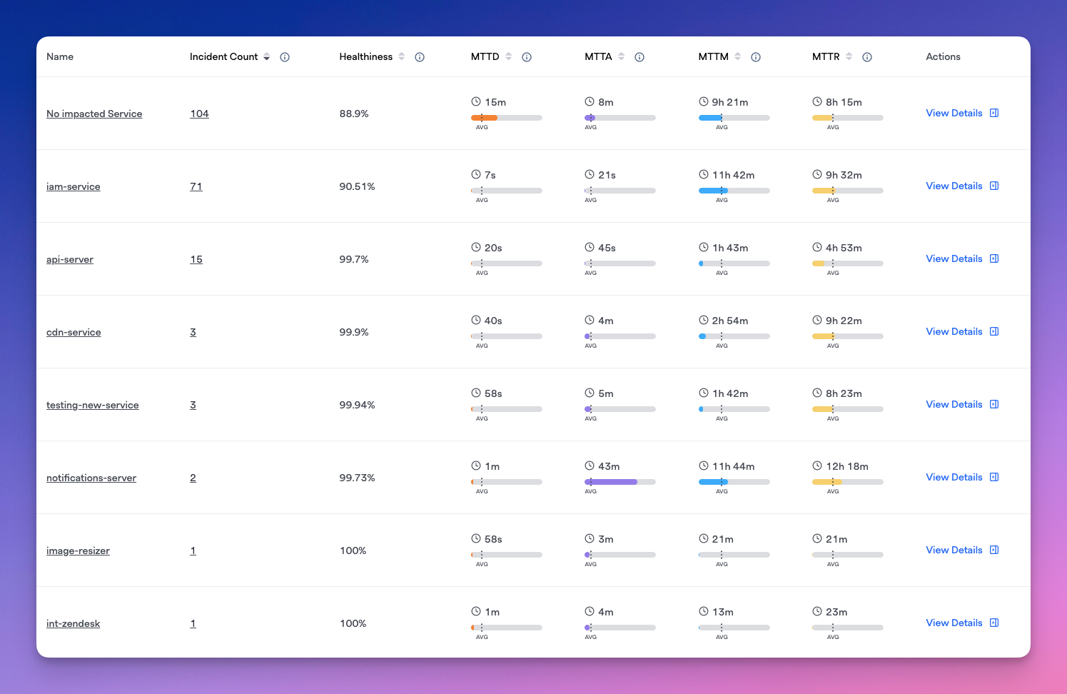
Table of components with various metrics
The table displays each component within the selected grouping along with incident count, healthiness measure, and any configured MTTx metrics you have for each row.
Within each table row, you'll also see bars that indicate that service's times for each metric in comparison to averages across all of the shown incidents for a selected filter and time range. You can use this to do compare things, for example, "How quickly issues (MTTD) are detected in Service A vs. other services" or "How fast does Team 1 acknowledge an incident (MTTA) in comparison to other teams," etc.
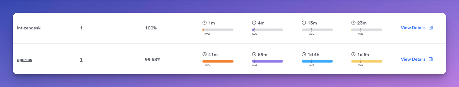
For example, app-ios service has much slower than average MTTx times, while int-zendesk has much faster than average
For each row, you can also click on View Details to expand a side drawer showcasing that component's specific MTTx metrics and incident count/MTTx over time graphs.
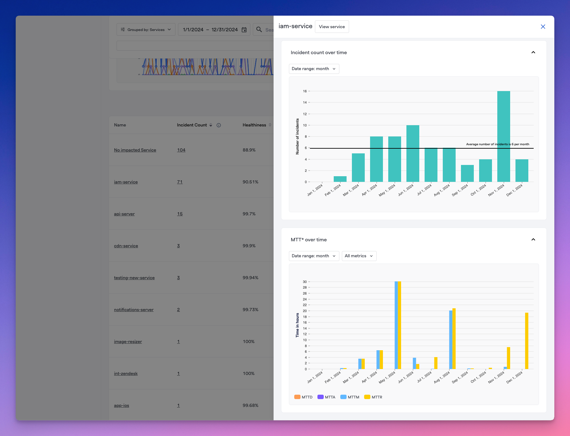
Expanding the side drawer on each individual component in the table
Next Steps
- Custom Milestones and Metrics - For understanding and customizing your milestones and MTTx metrics
- Intro to Service Catalog - Setting up and customizing your service catalog and components
- Custom Fields - Configuring custom fields for your incidents
Updated 3 months ago